Each year the Foothills Camera Club here in Calgary has a competition called the Special Five. You are allowed to enter one picture for each of five themes. (You could theoretically enter one shot that conveys all five themes and though it has been suggested its never actually been done). I had some shots in my collection that could serve but I wanted to get something unique for the competition. Here are three images that I shot this weekend for the competition.
Abstract - "Lyrical Destruction"
This was probably the most interesting shot and despite the work, it was pretty easy. I took a dead CD and beat it with a hammer and cut and scratched it with a pair of scissors. Next I put a couple of drops of grenadine and olive oil on the reflection surface. My SB600 to camera right provided a flick of light which showed off the crazy colors. I got in nice and tight with my macro lens to (hopefully) disconnect the viewer from what the scene really is and transport them to this place.
Eye(s) - Mechanical Iris
Again, I had a macro in mind with this. This shot actually had a few incarnations in my head but eventually I decided to go off the beaten path and hope that the judges were open-minded enough for my interpretation. To add to the idea I decided to color the aperture blades in Lightroom 2 to make them look more like an iris.
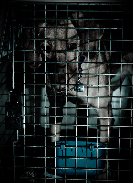
Isolated - "Inmate for a Day"
This was another quick setup. Hudson gets put into his kennel each day when my wife and I go to work. Suffice to say he really doesn't like it. I wanted to convey his feeling of isolation in this shot and wanted to make it look prison like. (Now I feel guilty for putting him in his kennel.)
I put my SB600 to camera right near the kennel and more or less killed the ambient light I had in the room. In Lightroom I cooled the shot off and boosted the contrast to really give it an edgy look. I was going to remove the water dish but as soon as I opened the kennel Hudson made a run for it. My dog is nothing if he isn't smart.
Thoughts and images along the path of photographic discovery.
Monday, February 21, 2011
Sunday, February 13, 2011
My latest iStockphoto reject and what I (and you) can learn from it
I submitted an image to iStockphoto a few weeks ago that I thought would possibly be a good seller. Sad to say, it got rejected. I've shown the image to a few people and generally people wondered why it would get rejected. When you look at the image at around 25% there's not a lot wrong with it. At least not from the layman's perspective.
Reviewers look at images a 100% though. Unfortunately if there are any issues they will be glaringly obvious at 100%. The first item they mention is artifacting. In the case of my image it was from digital noise. I believe I shot the image a 1600 ISO. If you click on the image below you can see that there is a fair bit of noise.
The other issue they had was with focus. I had to disagree a little with this one but once again when I viewed the image at 100% I could see that my focus was not on the candy or even the fingers but rather on the upper part of the hand. That being said, I recall that the writing on the candy itself was blurry which might explain why the reviewer thought the image was out of focus. Regardless of whether it was because of being out of focus or bad printing by the candy maker the bottom line is that the part that needed to be sharp was blurry.
The last issue was with the "overall composition" of the image. That I couldn't disagree with. Their explanation went more with the shadows and the overall exposure. I have to admit that while it wasn't bad it certainly wasn't great. I also think that the background, while not distracting also wasn't useful in most applications. It had a definite color cast to it (pumpkin orange - yuck) and there was some odd shadows in the background that limited the image's usefulness. I also had my subject just below dead center in the image.
So naturally there is a lesson to be learned here. Simply stated I need to start thinking like a reviewer. Now in hindsight, I personally thought this was just an okay image and nothing more. I did however get a few hits for this image on my Flickr stream from Google searches which was a big reason I decided to upload it. While it conceptually it was good, though, the execution was suffering. All in all however it was a good image to learn from.
Subscribe to:
Comments (Atom)


